Where it began
The project began at home, in the middle of real newborn days and nights. The question was never “How do we build the biggest feeding app?” It was much simpler: what do mothers actually need when they are exhausted, feeding often, and trying to keep the small details straight?
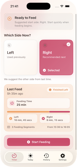
Over the first months with our son, we saw the same needs come up again and again: knowing which side was last, seeing how long the last feed took, checking how long it had been, and being able to look back over the day without digging through clutter. That is why the Timer came first: start, stop, see what matters, and move on.
Why we released Lite first
We wanted to put something real into mothers’ hands sooner, not wait until every possible idea had been designed, built, tested, and maintained. Releasing Feeding Timer Lite first let us focus on the exact features that actually helped in daily life, instead of delivering a heavy app full of things people might never use or care about.
That decision shaped the whole product. Lite is not a cut-down afterthought. It is the part we knew was genuinely useful, polished around real feeding life first, and released so we could keep learning from what mothers and caregivers truly value.
What nine months taught us
Over nine months, we learned far more from everyday use than we ever could have learned by guessing in advance. We saw which moments mattered most, which screens were opened repeatedly, and which details gave real reassurance instead of just adding more noise.
The main things we saw were clear: mothers wanted fast timing, side memory, a clean daily overview, simple history, and enough context to feel confident without having to think too hard. Those became the heart of Lite. Once we were sure they mattered, we kept improving them instead of distracting ourselves with feature bloat.
Some of that lived experience appears in How Logging Feeds Gave Me Peace of Mind, How Our Nights Changed Forever, and The First Growth Spurt.
What made it into Lite
Feeding Timer Lite includes the parts we saw were needed again and again, not just the parts that sounded impressive on a feature list. That means timing feeds quickly, checking the day clearly, and keeping the core feeding history easy to understand without turning the app into work.
- Timer — focused on active timing when you need a quick start. Explore Timer
- Today — a clear day view so you can make sense of what has already happened. See Today
- Daily Journal — scroll back through previous days when you need context. Open the Journal
- Offline-first simplicity — quick, private tracking without accounts, clutter, or distractions.
We deliberately left statistics out of Lite for now. We were not convinced that every mother needed them, and we did not want to add maintenance and complexity before we were sure they truly helped. If and when deeper summaries belong, they should be earned by real use, not added by default.
Why we added Apple Watch and Live Activities
Once the core feeding flow was right, we added the things that made that simple flow even easier to live with. That is why Feeding Timer Lite also includes Apple Watch support and Live Activities.
Those features were not added to make the app sound modern. They were added because they reduce friction: a mother or caregiver can glance quickly, stay in the moment, and spend less time unlocking and navigating a phone. When a feature genuinely helps the feeding experience feel lighter, it belongs. When it does not, we leave it out.
Principles that don’t change
- Private by default — your data stays on your device.
- Clarity first — helpful at 3 a.m.
- Zero friction — start, stop, done.
- No accounts, no ads, no upsells.
More on the philosophy in Free Baby Feeding App and Why We Built This.
Built for real nights
Gentle colors, clear fonts, and thoughtful layout — so you can stay with your baby, not your phone.
If you want the backstory: How Our Nights Changed Forever and How a Baby Timer Brought Us Closer.
Why we want to work with midwives
We would especially love to work more closely with midwives, because those first weeks matter so much. When a mother is trying to establish feeding, recover from birth, and make sure her baby is getting enough, calm and clear information can make a real difference.
A simple feeding record can help mothers feel more confident that feeds are happening often enough, help them answer practical questions during visits, and support the wider goal of helping a baby return to birth weight well in those early days.
Just as importantly, we want midwives to shape the app with us. Their real-world experience can tell us what should be added, what should be improved, and what should be removed so the app keeps benefiting mothers and their children instead of becoming more complicated than it needs to be.
What’s next
Feeding Timer Lite is the version we wanted to release first because it already delivers the features we saw were genuinely needed. The broader Feeding Timer vision is still important, and we will keep building on what we have learned instead of adding complexity for its own sake.
If you want something you can use now, start with the Lite version on the App Store. If you want to follow the bigger journey, you can explore the full feature set, read the blog, and see how the product continues to evolve.
